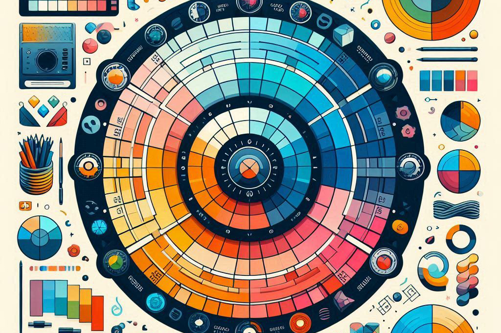
Color Theory in UI/UX Design: Choosing the Right Palette for Your Project
By Kainat Chaudhary
Color is a powerful tool in UI/UX design, capable of influencing emotions, guiding user behavior, and creating a memorable brand identity. Understanding color theory and how to choose the right color palette is essential for creating effective and visually appealing designs. In this post, we'll explore the basics of color theory and provide tips on selecting the perfect color palette for your project.
Understanding Color Theory
Color theory is the study of how colors interact with each other and the effects they have on viewers. It encompasses the color wheel, color harmonies, and the psychological impact of colors. By mastering color theory, designers can create harmonious and aesthetically pleasing color schemes that enhance user experience.
The Color Wheel
The color wheel is a visual representation of colors arranged in a circle, showing the relationships between primary, secondary, and tertiary colors. Primary colors (red, blue, yellow) are the base colors from which all other colors are created. Secondary colors (green, orange, purple) are formed by mixing primary colors. Tertiary colors are combinations of primary and secondary colors.
Color Harmonies
Color harmonies are combinations of colors that are pleasing to the eye. These harmonies are derived from the color wheel and can be used to create balanced and visually appealing designs. Common color harmonies include:
- Complementary: Colors opposite each other on the color wheel (e.g., red and green).
- Analogous: Colors next to each other on the color wheel (e.g., blue, blue-green, and green).
- Triadic: Three colors evenly spaced around the color wheel (e.g., red, yellow, and blue).
- Split-Complementary: A base color and two colors adjacent to its complementary color (e.g., blue, yellow-orange, and red-orange).
- Tetradic (Double-Complementary): Two complementary color pairs (e.g., blue and orange, green and red).
Psychology of Colors
Colors evoke emotions and can influence user behavior. Understanding the psychological impact of colors helps designers choose palettes that align with the project's goals and target audience. Here's a brief overview of common color associations:
- Red: Excitement, passion, and urgency.
- Blue: Trust, calmness, and professionalism.
- Yellow: Optimism, energy, and warmth.
- Green: Growth, health, and tranquility.
- Orange: Enthusiasm, creativity, and friendliness.
- Purple: Luxury, wisdom, and spirituality.
- Black: Sophistication, elegance, and authority.
- White: Purity, simplicity, and cleanliness.
Choosing the Right Palette
Selecting the right color palette involves considering the project's purpose, target audience, and brand identity. Here are some tips to help you choose an effective palette:
- Define the project's goals and the emotions you want to evoke.
- Research the target audience's preferences and cultural associations with colors.
- Analyze competitors' color schemes to differentiate your design.
- Use color harmonies to create a balanced and visually appealing palette.
- Test the palette on different devices and in various lighting conditions to ensure consistency.
Tools for Creating Color Palettes
Several online tools can help you create and test color palettes. These tools allow you to experiment with different color combinations and ensure accessibility compliance. Some popular options include:
- Adobe Color
- Coolors
- Color Hunt
- Paletton
- Canva Color Palette Generator
Mastering color theory and choosing the right palette are essential skills for any UI/UX designer. By understanding the principles of color harmony, the psychology of colors, and using the right tools, you can create visually stunning and effective designs that resonate with your audience. Experiment with different color schemes and find the perfect palette that brings your projects to life.

Staying Inspired: Where to Find Fresh Ideas for Your Designs
Discover where to find inspiration for your designs and how to keep your creative spark alive.

Design Like a Pro: Tips and Tricks to Elevate Your Figma Skills
Master the art of Figma with these expert tips and tricks. Learn how to design like a pro and take your skills to the next level.

Prototyping for UI/UX: Tools and Techniques to Bring Your Ideas to Life
Explore essential tools and techniques for prototyping in UI/UX design. Learn how to effectively bring your design ideas to life through prototyping.

Exploring the Intersection of Graphic Design and User Experience
Discover how graphic design and user experience come together to create impactful digital products.