Typography Fundamentals: Making Text Speak in Design
By Kainat Chaudhary
What is Typography?
Typography is more than just picking a pretty font. It’s the art and technique of arranging type to make written language legible, readable, and appealing when displayed. As a UI/UX and graphic designer, I've learned that typography plays a crucial role in shaping how users interact with content. It influences everything from the mood of the design to the way the message is conveyed.
"Typography is the craft of endowing human language with a durable visual form." — Robert Bringhurst
Why Typography Matters
Good typography creates a visual hierarchy, ensuring that the most important elements stand out while enhancing readability. In my experience, choosing the right font can elevate the entire design, while poor typography can confuse users and drive them away. It sets the tone of a project and can even influence a user’s emotions and decision-making.
- Improves readability and legibility
- Conveys mood and personality
- Creates visual hierarchy
Key Elements of Typography
There are a few fundamental elements of typography that every designer must know. Understanding these will help you create text that not only looks good but is also effective in conveying your message.
- Fonts: Serif, sans-serif, and display fonts each evoke different emotions and suit different design purposes.
- Hierarchy: This refers to the arrangement of elements in a way that implies importance. Larger, bolder fonts typically indicate something significant, while smaller fonts suggest supporting details.
- Spacing: Includes kerning, leading, and tracking. Proper spacing ensures that text is easy to read and visually appealing.
Choosing the Right Font
Font selection is an integral part of design. A wrong font can completely misrepresent a brand or a message. When I work on projects, I always ask myself: what emotion do I want to evoke? Serif fonts give a classic and formal feel, while sans-serif fonts provide a modern and clean look. For creative projects, I lean toward display fonts to give an artistic flair.
"A designer knows they have achieved perfection not when there is nothing left to add, but when there is nothing left to take away." — Antoine de Saint-Exupéry
Hierarchy and Alignment
Visual hierarchy helps users scan a design quickly and understand the information flow. By playing with font size, weight, and alignment, I create emphasis on what’s important. For example, a large bold headline grabs attention, while a subheading in lighter text supports it without overpowering. Alignment also affects how readable the text is—centered text feels more formal, while left-aligned text offers a clean and structured appearance.
White Space and Contrast
White space is your friend. It provides breathing room for the text and lets the design elements shine. Too much text crammed together overwhelms the viewer. I’ve noticed that the use of contrast between text color and background makes a big difference. High contrast makes text easier to read, while low contrast can create a subtle, elegant feel but risks poor readability.
- Leave enough white space around text
- Use contrasting colors for readability
- Avoid text-heavy designs without breaks
Responsive Typography
With mobile devices becoming the primary way users interact with content, responsive typography has become essential. Text must adjust seamlessly to various screen sizes. In my projects, I always make sure that headings, paragraphs, and spacing adapt to mobile, tablet, and desktop views without compromising the design's integrity.
/* CSS for responsive typography */
body {
  font-size: 16px;
}
@media (max-width: 768px) {
  body {
    font-size: 14px;
  }
}
@media (max-width: 480px) {
  body {
    font-size: 12px;
  }
}
Conclusion
Typography is a powerful tool in a designer’s arsenal. By mastering the art of typography, you can create designs that not only look visually appealing but also effectively communicate your message. Remember, typography is more than just picking a font—it’s about creating an experience for the user. So, the next time you work on a design project, pay attention to the typography, and let your text speak volumes!

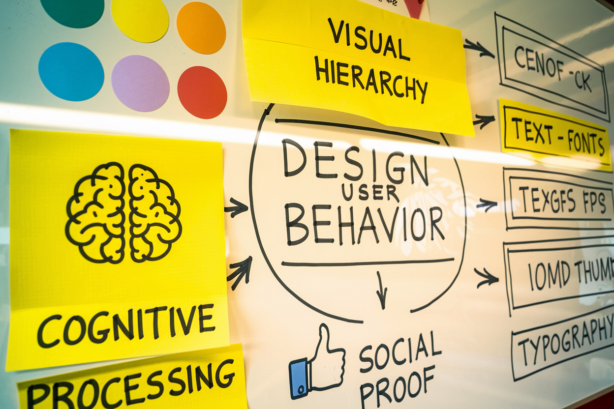
The Psychology of Design: How Design Choices Affect User Behavior
Understanding the psychology of design is crucial for creating effective user experiences. This post explores how design choices impact user behavior and decision-making.

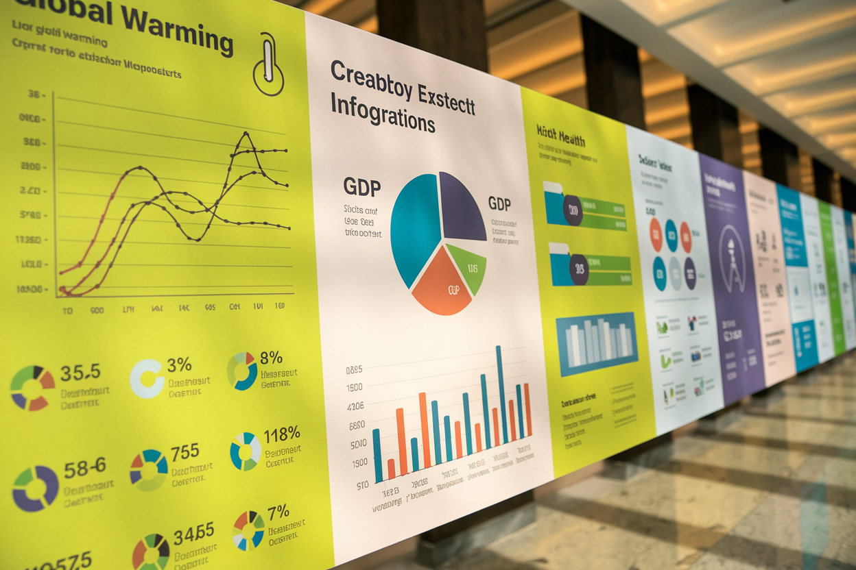
Creating Effective Infographics: Tips for Simplifying Complex Information
Discover how to create effective infographics that simplify complex information. This guide provides essential tips and best practices for web designers.

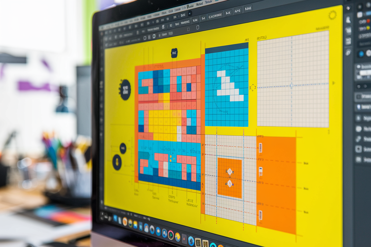
The Role of Grids and Layouts in Effective Graphic Design
Explore the essential role of grids and layouts in effective graphic design. Learn how these tools enhance visual hierarchy, balance, and user experience, drawing from my personal experiences and knowledge as a UI/UX designer.

The Principles of Design: Balance, Contrast, and Hierarchy
A deep dive into the core principles of design—Balance, Contrast, and Hierarchy. Learn how to apply these essential elements to create visually compelling and user-friendly designs.