The Role of Grids and Layouts in Effective Graphic Design
By Kainat Chaudhary
Understanding the Basics of Grids and Layouts
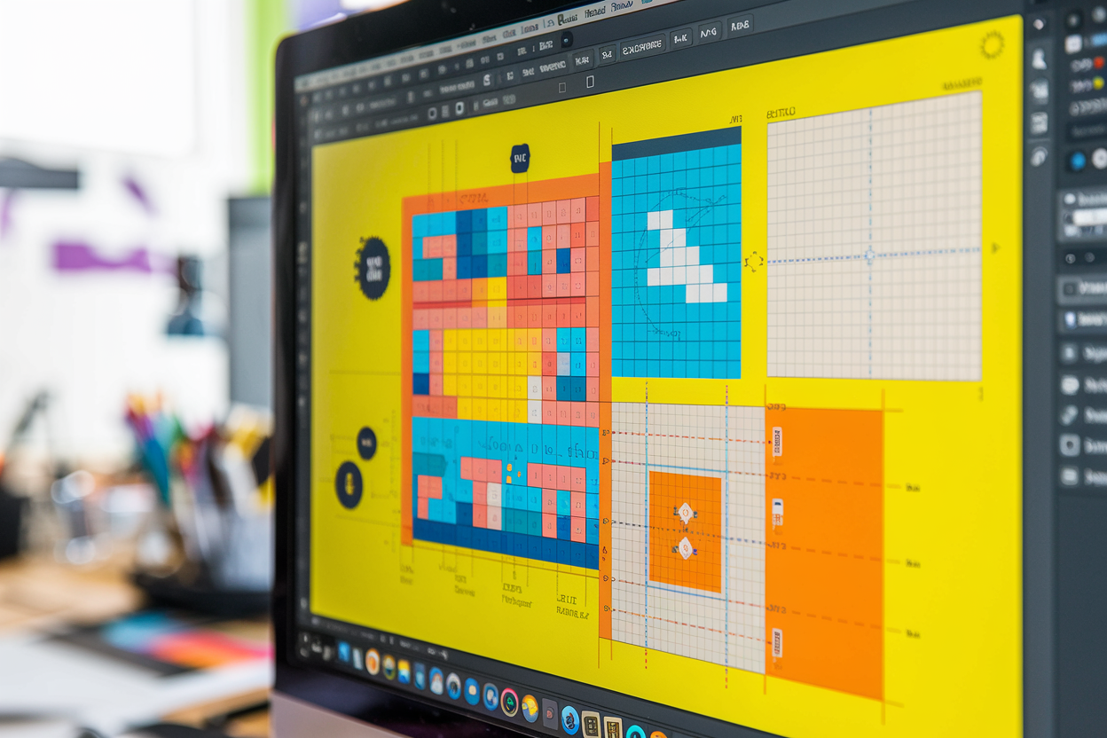
Grids and layouts are foundational concepts in graphic design, providing structure and organization to design elements. A grid serves as an invisible framework that helps align content, ensuring a coherent and aesthetically pleasing composition. I often rely on grids to maintain consistency and balance in my designs, particularly when working on complex projects like web interfaces or print materials. Grids help me break down the design into manageable sections, allowing for better alignment and proportion.
“Good design is all about making other designers feel like idiots because that idea wasn’t theirs.” — Frank Chimero
How Grids Influence Visual Hierarchy
One of the most significant roles of a grid is to establish visual hierarchy. This means guiding the viewer’s eye to the most important parts of the design in a logical order. For example, in a website design, the grid can emphasize key elements like headings, calls to action, or images, making them stand out against less critical elements. I've noticed that well-defined grids often result in cleaner designs where users instinctively know where to look first.
- Aligning content for consistency
- Creating proportional balance
- Ensuring visual harmony
Types of Grids in Graphic Design
Grids come in various forms depending on the type of project. Some of the most common grids I’ve used in my work are: - Column grids: Typically used in web and editorial design, column grids divide the page vertically and are great for organizing text-heavy layouts. - Modular grids: These grids are used when working with both text and images, creating uniform boxes that can contain either type of content. - Baseline grids: These help align text and are used in typography-heavy projects to ensure consistent line spacing.
- Column grids: Organize content vertically
- Modular grids: Combine text and images
- Baseline grids: Maintain text alignment
Best Practices for Using Layouts
Layouts are more than just placing elements on a page; they create the overall structure of your design. When crafting layouts, I always consider the following principles: - Consistency: Maintaining consistent spacing, margins, and alignment across all elements. - Balance: Ensuring that no part of the design feels heavier than another, which can be achieved through equal distribution of elements. - Flexibility: Designing layouts that can adapt to different screen sizes or print formats without losing their integrity.
“A grid is like underwear. You wear it, but it’s not to be exposed.” — Massimo Vignelli
I often remind myself of this quote because, while grids are crucial to the structure of a design, they shouldn’t be the focal point. They are tools to enhance a design’s clarity and flow, not rigid rules that limit creativity.
Looking Ahead
As I embark on a new professional journey, I carry with me the skills, experiences, and memories from Nixxie International. This farewell is not just an ending but a new beginning. I am excited about the future and the opportunities that lie ahead, knowing that the foundation built here will support me in all my endeavors.
- Embracing new opportunities
- Applying learned skills
- Cherishing past experiences

The Psychology of Design: How Design Choices Affect User Behavior
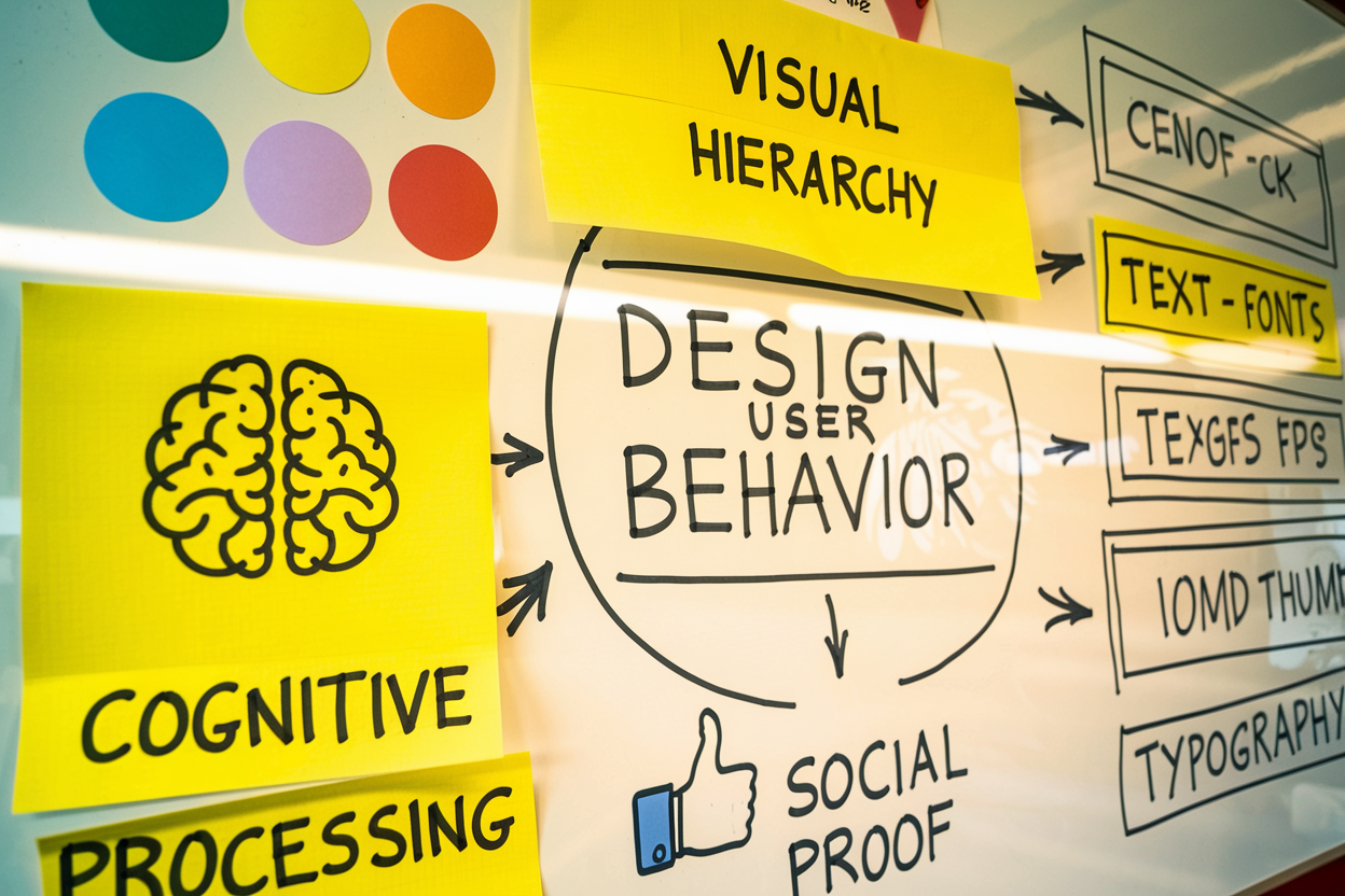
Understanding the psychology of design is crucial for creating effective user experiences. This post explores how design choices impact user behavior and decision-making.

Designing Intuitive Navigation: Best Practices for Menus and Buttons
Explore the best practices for designing intuitive navigation in UI. Learn how effective menus and buttons can enhance user experience and improve website usability.

Understanding User Feedback: Designing Micro-Interactions for Better Engagement
Explore the significance of micro-interactions in UI design and how they enhance user feedback and engagement. Learn best practices for creating effective micro-interactions.