Designing Intuitive Navigation: Best Practices for Menus and Buttons
By Kainat Chaudhary
The Importance of Intuitive Navigation
Intuitive navigation is crucial for providing a seamless user experience. It allows users to explore a website or app effortlessly, enhancing their overall satisfaction. When users can easily find what they are looking for, they are more likely to engage with the content, leading to higher retention rates and conversions. Conversely, poor navigation can frustrate users and drive them away, making intuitive design essential for any digital platform.
Key Principles of Intuitive Navigation
To design intuitive navigation, consider the following key principles: 1. **Clarity:** Navigation elements should be clear and descriptive, allowing users to understand their purpose at a glance. 2. **Consistency:** Maintain a uniform design and layout for menus and buttons across all pages, enabling users to predict interactions. 3. **Simplicity:** Avoid cluttering the navigation with too many options. A simple, clean design helps users focus on the most important elements.
Best Practices for Designing Menus
When creating menus, follow these best practices to ensure they are intuitive: 1. **Limit Menu Items:** Aim for a maximum of 5-7 primary menu items to prevent overwhelming users. If necessary, use submenus for secondary options. 2. **Prioritize Content:** Place the most important and frequently accessed items at the beginning of the menu. This helps users find what they need quickly. 3. **Use Descriptive Labels:** Use clear and descriptive labels for menu items. Avoid jargon or technical terms that may confuse users. 4. **Consider Visual Hierarchy:** Use visual cues, such as font size and weight, to create a clear hierarchy within the menu. Highlight active items or sections to guide users effectively.
Good navigation is about creating a clear path for users. It's the roadmap that guides them through their experience.
Best Practices for Designing Buttons
Buttons play a crucial role in navigation, and designing them effectively is essential. Here are some best practices: 1. **Make Buttons Stand Out:** Use contrasting colors to make buttons visually distinct from other elements. They should be easily recognizable and catch the user's eye. 2. **Use Clear Call-to-Actions (CTAs):** Use actionable language that clearly indicates the button's function, such as "Sign Up," "Learn More," or "Download." 3. **Ensure Sufficient Size and Padding:** Buttons should be large enough to tap easily on mobile devices. Provide adequate padding to ensure they are not cramped or difficult to interact with. 4. **Provide Feedback on Interaction:** Incorporate hover effects or animations to give users feedback when they interact with buttons. This can enhance the sense of responsiveness and engagement.
Mobile Navigation Considerations
With the increasing use of mobile devices, it’s vital to optimize navigation for smaller screens. Here are some considerations: 1. **Use a Hamburger Menu:** A hamburger menu can save space while providing access to multiple menu items. Ensure it’s easily recognizable and accessible. 2. **Prioritize Touch Targets:** Make sure that buttons and links are large enough for users to tap easily without error. 3. **Test for Usability:** Conduct usability testing to ensure that your mobile navigation is intuitive. Gather feedback to make necessary adjustments.
Conclusion
Designing intuitive navigation is essential for enhancing user experience and ensuring users can easily access content. By following best practices for menus and buttons, you can create a user-friendly interface that keeps users engaged. Remember that effective navigation not only improves usability but also contributes to the overall success of your digital platform.

The Psychology of Design: How Design Choices Affect User Behavior
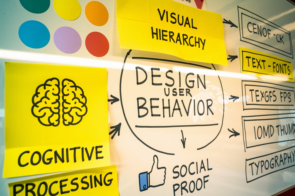
Understanding the psychology of design is crucial for creating effective user experiences. This post explores how design choices impact user behavior and decision-making.

Using Animation in UI Design: Enhancing User Experience Through Motion
Animation in UI design plays a crucial role in enhancing user experience by providing visual feedback, guiding users, and adding an element of delight. This post explores the effective use of animation in UI design.

The Evolution of Web Design: A Look Back and Forward
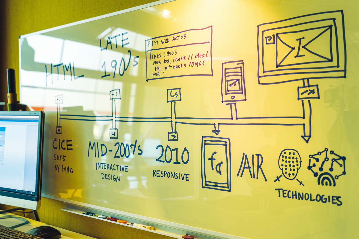
Explore the fascinating journey of web design from its early days to modern practices. Discover key milestones, current trends, and future predictions shaping the web design landscape.

Understanding User Feedback: Designing Micro-Interactions for Better Engagement
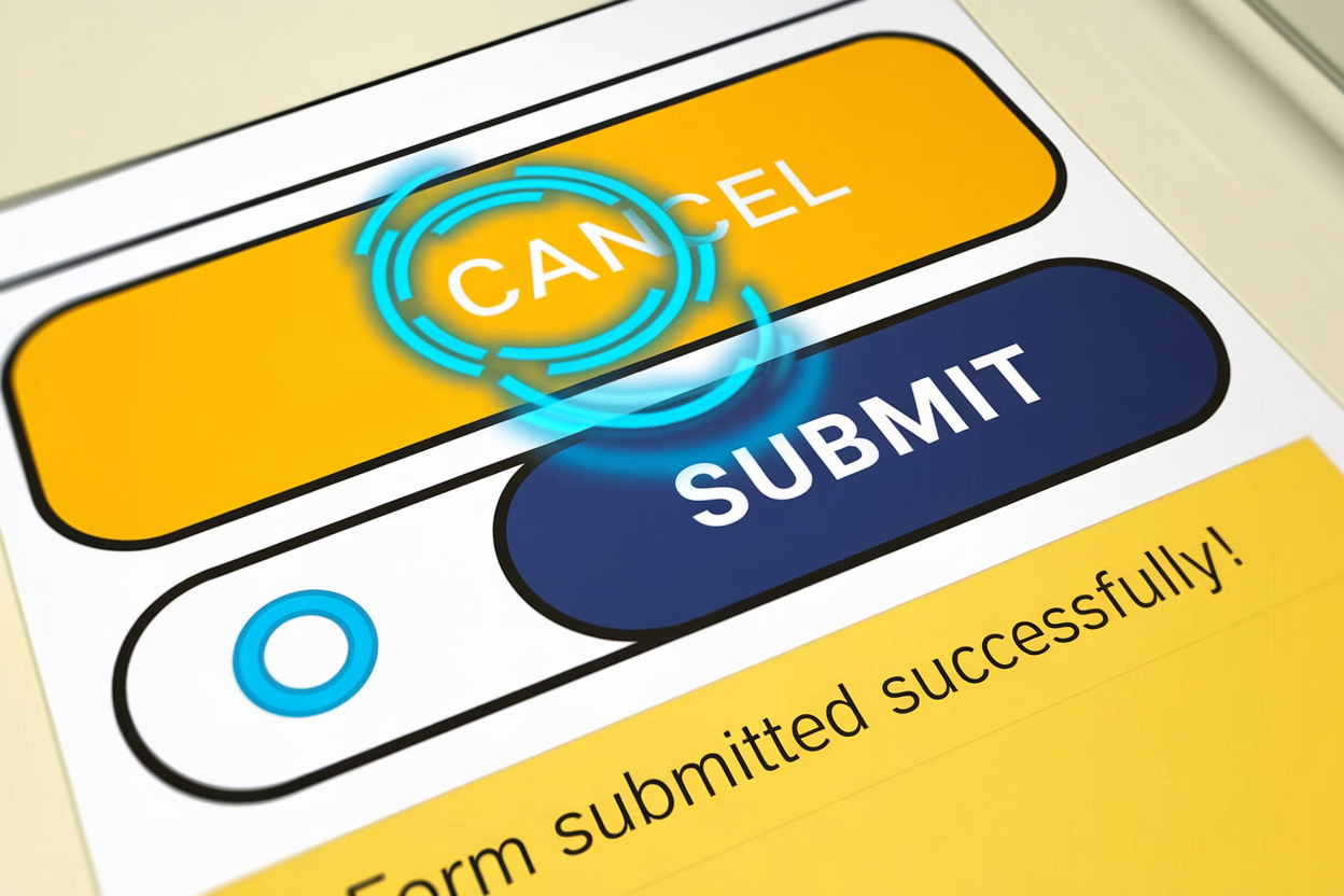
Explore the significance of micro-interactions in UI design and how they enhance user feedback and engagement. Learn best practices for creating effective micro-interactions.