The Role of White Space: Creating Breathing Room in Your UI Layouts
By Kainat Chaudhary
Understanding White Space in UI Design
White space, often referred to as negative space, is the area between design elements. It is not merely an empty void; rather, it serves a crucial role in enhancing the user experience. Effective use of white space allows for a cleaner layout, guiding users through the interface without overwhelming them. It creates breathing room that fosters clarity and focus, allowing users to engage with the content meaningfully.
Why White Space is Essential
The importance of white space cannot be overstated. Here are several reasons why it is essential in UI design: 1. **Enhances Readability:** Ample white space makes text more legible, reducing eye strain and allowing users to absorb information easily. 2. **Increases Focus:** By separating elements, white space directs the user's attention to important components, such as calls to action or key messages. 3. **Creates Balance:** A well-balanced layout with sufficient white space can make an interface appear more harmonious, enhancing the overall aesthetic appeal. 4. **Promotes User Engagement:** Users are more likely to interact with a clean and organized design, leading to increased engagement and satisfaction.
Different Types of White Space
White space can be categorized into two types: **active white space** and **passive white space**. - **Active White Space** is intentionally left blank to direct attention and improve usability. For example, the space around a button makes it easier to identify and click. - **Passive White Space**, on the other hand, is the empty space that exists in the layout without a specific purpose. It provides a sense of organization and structure but is not specifically designed to guide user interactions.
Best Practices for Using White Space
Here are some best practices for effectively utilizing white space in your UI designs: 1. **Use Grids:** Grids help in organizing elements uniformly, ensuring that there is adequate space between components. 2. **Group Related Items:** Placing related elements close together with appropriate white space around them helps users understand the relationship between them. 3. **Limit Content:** Avoid clutter by limiting the amount of content on a single page. Use white space to create breathing room for users to digest information. 4. **Prioritize Elements:** Use white space strategically to highlight important information or actions. This guides the user’s eye to key areas without distractions.
White space is not a waste of space; it is a powerful tool in design that enhances clarity, engagement, and user experience.
Common Misconceptions About White Space
Despite its benefits, many designers hesitate to use white space due to common misconceptions. Here are a few myths to debunk: 1. **More Elements Equals Better Design:** Many believe that cramming more elements into a layout makes it more informative. In reality, excess elements can overwhelm users and lead to confusion. 2. **White Space is Wasted Space:** Some designers view white space as a waste of valuable real estate. However, it serves to enhance usability and aesthetics, making it an investment rather than a cost. 3. **Only Applicable in Minimalist Design:** While white space is prevalent in minimalist design, it is equally effective in complex layouts, providing clarity and structure.
The Impact of White Space on User Experience
Incorporating white space effectively can significantly enhance user experience. When users encounter a well-structured design that uses white space intelligently, they are likely to find it more enjoyable and easier to navigate. This positive experience leads to greater satisfaction, increased user retention, and ultimately, better conversion rates.
Conclusion
White space plays an integral role in UI design, providing essential breathing room that enhances usability and aesthetics. By understanding its significance and applying best practices, designers can create more engaging and user-friendly interfaces. Embracing white space not only improves clarity but also enriches the overall user experience.

The Art of Minimalist Web Design: Less is More
Explore the art of minimalist web design and discover how 'less is more.' Learn the key principles, benefits, and tips for creating visually appealing and functional websites.

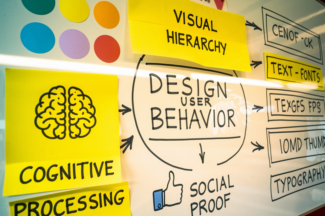
The Psychology of Design: How Design Choices Affect User Behavior
Understanding the psychology of design is crucial for creating effective user experiences. This post explores how design choices impact user behavior and decision-making.

Using Animation in UI Design: Enhancing User Experience Through Motion
Animation in UI design plays a crucial role in enhancing user experience by providing visual feedback, guiding users, and adding an element of delight. This post explores the effective use of animation in UI design.

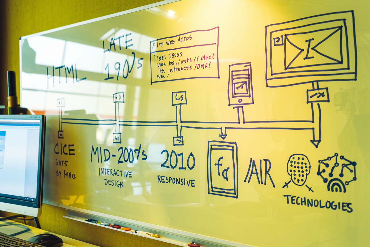
The Evolution of Web Design: A Look Back and Forward
Explore the fascinating journey of web design from its early days to modern practices. Discover key milestones, current trends, and future predictions shaping the web design landscape.