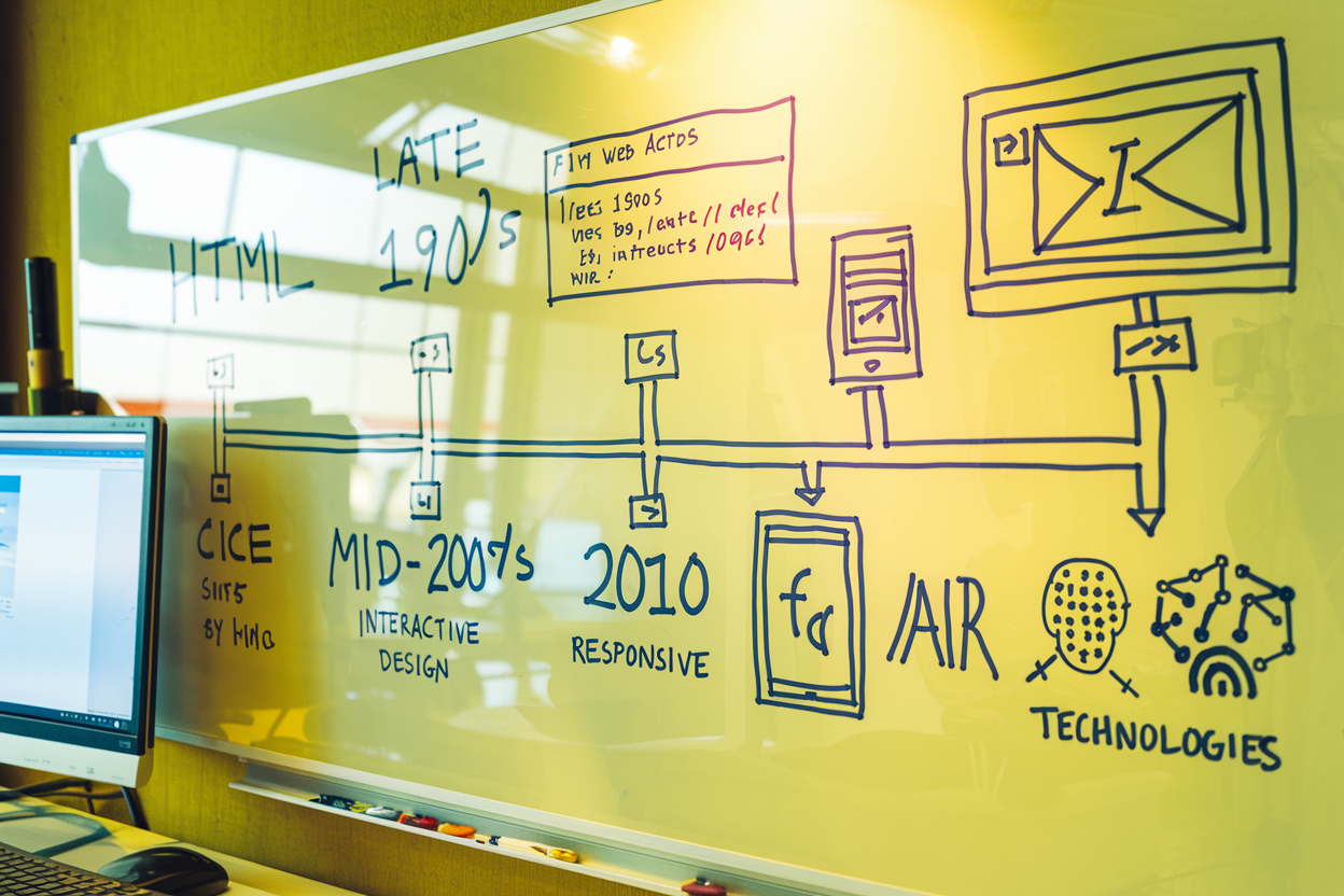
Crafting Effective Call-to-Action (CTA) Buttons: A UI Designer’s Guide
By Kainat Chaudhary
Understanding the Importance of CTA Buttons
Call-to-action (CTA) buttons are essential elements in user interface design that guide users toward specific actions. Whether it's signing up for a newsletter, making a purchase, or downloading a resource, well-crafted CTA buttons significantly impact user engagement and conversion rates. Effective CTAs not only attract attention but also motivate users to take the desired action, making them crucial for achieving business goals.
Key Elements of Effective CTA Buttons
When designing CTA buttons, consider the following key elements: 1. **Clear and Actionable Text:** The button text should be concise and clearly convey the action users are expected to take. Use strong action verbs to create urgency and motivation. 2. **Contrasting Colors:** Use colors that stand out from the rest of the interface to draw attention to the CTA. Ensure that the button's color contrasts well with the background, making it easily noticeable. 3. **Appropriate Size and Shape:** The size of the button should be large enough to be easily clickable, especially on mobile devices. Rounded corners often create a more approachable and inviting look.
The CTA button is a crucial touchpoint in the user journey, serving as a bridge between user interest and desired action.
Best Practices for Designing CTA Buttons
To maximize the effectiveness of your CTA buttons, follow these best practices: 1. **Limit Choices:** Avoid overwhelming users with too many CTAs. Focus on one primary action per page to direct attention and increase the likelihood of conversion. 2. **Use Microcopy:** Consider adding brief explanations or hints around the CTA. This microcopy can clarify what users can expect after clicking, reducing uncertainty. 3. **Incorporate Visual Cues:** Use arrows, icons, or animations to guide users' eyes toward the CTA. Subtle movements can attract attention without being distracting. 4. **Position Strategically:** Place CTA buttons in prominent locations on the page, such as above the fold, at the end of content, or after persuasive sections. Users should naturally encounter the CTA as they engage with the content.
A/B Testing Your CTA Buttons
A/B testing is a valuable technique for optimizing CTA buttons. By creating variations of your buttons (e.g., different text, colors, or sizes), you can test which version resonates best with your audience. Monitor key metrics such as click-through rates and conversions to make data-driven decisions about your CTA design. Continuous testing and refinement can lead to improved performance over time.
Mobile Considerations for CTA Design
With the increasing use of mobile devices, it's essential to ensure your CTA buttons are mobile-friendly. Here are some considerations: 1. **Thumb-Friendly Placement:** Position buttons within easy reach of users’ thumbs, typically towards the bottom half of the screen. 2. **Larger Click Targets:** Ensure that buttons are large enough for users to tap accurately without accidental clicks. 3. **Optimize Load Times:** Ensure that the page loads quickly to reduce bounce rates and improve the chances of users clicking on the CTA.
Conclusion
Crafting effective call-to-action buttons is vital for driving user engagement and achieving conversion goals. By focusing on clarity, usability, and strategic placement, you can design CTAs that resonate with users and encourage them to take the desired actions. Remember that continuous testing and refinement are key to optimizing your CTAs for the best performance.

Creating Compelling Landing Pages: A Guide for Web Designers
Learn how to create compelling landing pages that engage visitors and drive conversions. This guide covers best practices, essential elements, and design tips for web designers.

Using Animation in UI Design: Enhancing User Experience Through Motion
Animation in UI design plays a crucial role in enhancing user experience by providing visual feedback, guiding users, and adding an element of delight. This post explores the effective use of animation in UI design.

The Evolution of Web Design: A Look Back and Forward
Explore the fascinating journey of web design from its early days to modern practices. Discover key milestones, current trends, and future predictions shaping the web design landscape.